

MAKASSAR, Indonesia – Apr 1 2026/DSAI/ — As digital marketplaces continue to grow rapidly, not everyone experiences them in the same way. While online shopping offers convenience and accessibility for many, millions of users with color vision deficiencies still face hidden barriers when navigating apps. A recent study highlights how thoughtful design can transform digital platforms into truly inclusive spaces.
Published in Jutisi: Jurnal Ilmiah Teknik Informatika dan Sistem Informasi, this research focuses on developing a color-blind-friendly marketplace application using inclusive design principles. The study reveals that approximately 7.4% of the population experiences color blindness, yet many applications still overlook accessibility features, creating unequal user experiences .
At the heart of this innovation is a prototype application called Netra, designed specifically to address these challenges. Unlike conventional marketplace apps, Netra introduces adaptive visual features that allow users to customize the interface based on their type of color vision. This includes a dedicated “color-blind mode,” enabling users to adjust contrast, color palettes, and display settings for better visibility.
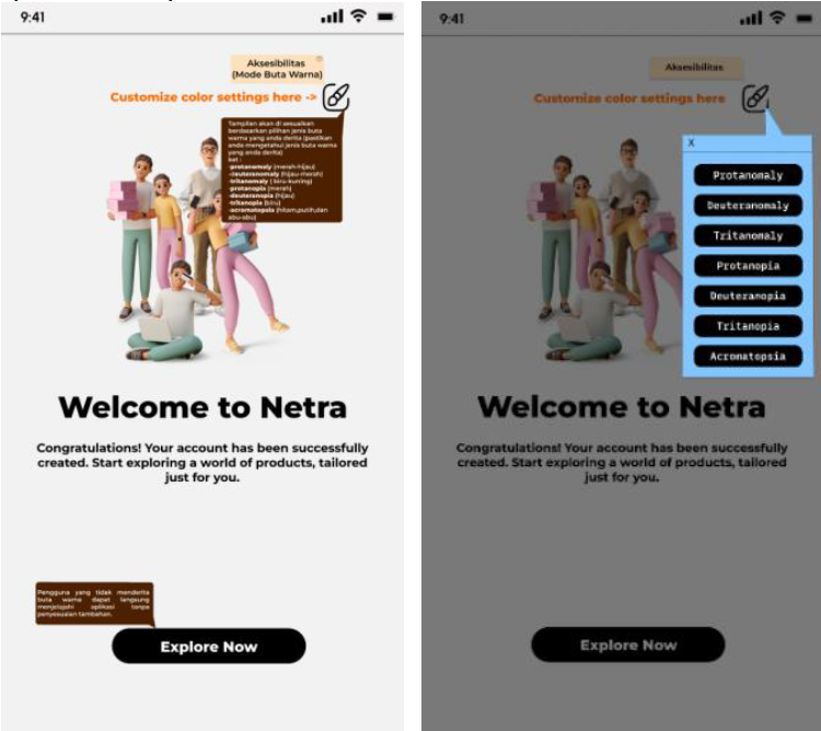
The development process combines Design Thinking and Design Science Research (DSR)—two powerful methodologies that prioritize user needs. Through interviews, usability testing, and questionnaires, researchers gained deep insights into real user challenges. For instance, users reported difficulties distinguishing colors, navigating menus, and understanding interface elements.
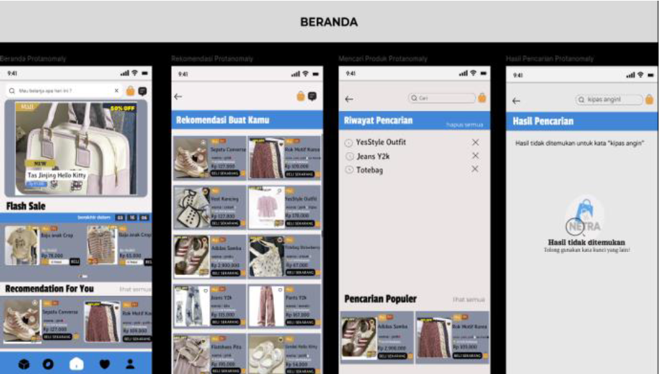
According to findings on page 10, usability testing revealed a total error time of 105 seconds, with color-blind users contributing 35.2% and non-color-blind users 64.8%. Interestingly, while color-blind users faced visual challenges, non-color-blind users struggled more with navigation and feature recognition. This highlights that improving accessibility can benefit all users, not just those with disabilities .
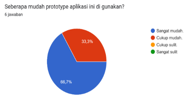
The prototype also includes smart features such as automatic color detection for product images, helping sellers—especially those with color vision deficiencies—accurately present their products. Additionally, dual display modes (normal and color-blind-friendly) ensure flexibility without compromising design aesthetics.
This research strongly aligns with multiple Sustainable Development Goals (SDGs). It supports SDG 10: Reduced Inequalities by promoting digital inclusivity, SDG 9: Industry, Innovation, and Infrastructure through technological advancement in UI/UX design, and SDG 4: Quality Education, as inclusive design principles can be applied to educational platforms as well.
Ultimately, the study demonstrates that inclusive design is not just a feature—it is a necessity. By prioritizing accessibility, developers can create applications that serve a broader audience, enhance user satisfaction, and foster equality in digital environments.
Article Metadata (Source of This Popular Scientific Writing):
Title: Rancangan Antarmuka Aplikasi Marketplace Inklusif Ramah Buta Warna
Journal: Jutisi: Jurnal Ilmiah Teknik Informatika dan Sistem Informasi
Publisher: STMIK Banjarbaru
Year: 2025 (Vol. 14, No. 1, April, pp. 374–385)
DOI: http://dx.doi.org/10.35889/jutisi.v14i1.2639
Authors & Contact:
Aulia Adha Putri*, Eliyah Acantha Manapa Sampetoding, Armin Lawi, Riskawati
Universitas Hasanuddin, Makassar, Indonesia
E-mail: auliaadhaputri17@gmail.com
In a world increasingly driven by digital interaction, this research reminds us that true innovation lies in inclusivity—designing technology not just for the majority, but for everyone